Emile Nolde – Sunderland University Art 380

Emile Nolde 

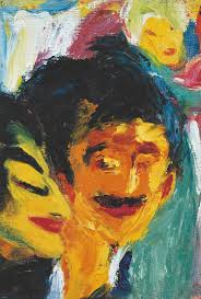
German painter in oils and watercolour of landscapes, still and figure composition, lithographer, etcher and wood-engraver. Emile Nolde’s style is interesting, I prefer his figurative paintings as pose to his landscape paintings. I just think the colours in the portraits are really vibrant and interesting. The facial expressions are really interesting because they leave me questioned and wanting to know more. I like the Neo Expressionistic style in which he works. It’s the way he fills the canvas which I think makes his bright colours work so well. 
Georg Baselitz – Sunderland University Art 380

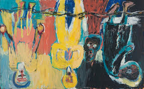
Georg Baselitz is a German painter/printmaker who has a raw style of rendering and a heightened palette in order to convey direct emotion. Embracing the German Expressionism that had been denounced by the Nazis, Baselitz returned the human figure to a central position in painting. The way Baselitz uses paint in his larger paintings is really something I like to see personally; I like the texture of the paint he uses because it’s always thick in layers which I find satisfying to look at. what I find interesting and most relatable in his work is how he paint and displays his subject’s upside down in order to slow down his process of painting as well as the viewer’s comprehension of the motif. The scale of his work motivates me to make my work large.

Art in Context exhibition

Final exhibition for art in context, This is my display above. I have a very large wall 4 feet off the ground which is perfect for my work to be displayed, The pieces that are currently up are my 6 Foot canvas and a few of my earlier works from the start of the year which are on found creates. I had the help of art technician Malcom to make sure the paintings sat straight against the wall and where even parted. I wanted the bigger painting to be in the middle to really make it bold. I have been looking at how mark Rothko and Basquiat chose to hang there exhibitions for inspiration and to really understand how to display my work properly.

A painting is not a picture of an experience, but is the experience-Mark Rothko

Transfiguration-Oliver de Sagazan

Recently I’ve been looking at multiple videos and works by Oliver de Sagazan. Painter, sculptor and performer, Olivier de Sagazan annihilates his own identity with clay and paint to become a living artwork. At once grotesque puppet and puppeteer he morphs from human to animal to astonishing hybrid creatures. His transformations go from deeply moving to the dark and disquieting.

The image below is from one of Olivers most famous videos titled ‘Transfiguration’ in which he builds a creepy clay mould on his face. I like everything about his work, the backgrounds, the video quality and even the music really is something different and disturbing. He creates some of the most creepiest masks I’ve ever seen.

Transfiguration gives a different meaning to the notion of life, offering captivating, disturbing, moving insights into the possibility and unpredictabilities of who we really are. ‘Disfigurement in art is a way to bring us face to face with real life’ 
Olivier de Sagazan

The beacon

The beacon centre Is a shopping outlet in North shields which holds an exhibition once a year for the students of Queen Alexandra college, they select 15 canvases that they think will look the best for the spaces. The canvases all have to be 6 foot by 6 foot squared which Is rather large. The beacon space is high up in the centre probably about 20 feet in the air which is perfect because theres windows all around that area so there will be a lot of light being let in. Im currently still working on my 6 foot canvas, the theme for the 6 foot canvas is light. Lat year I had my work up in the Beacon so I’m aware of the hanging struggle. I wanted to see how it was going to look once up and finished so I made a plan showing exactly what my work would look once up.

Above you can see the plan that I created for the beacon. I used photoshop to place my work into the space where I think it will if they select mine. Mine is the brightest one with the word light painted on it.

Yorkshire sculpture park

On the 2nd October 2017 I visited the Wakefield sculpture park with my uni group, when we arrived by coach it was such a nice bright day making it perfect for viewing outdoor sculptures. you could see the sculptures from the coach window which was cool. We started off looking at the works inside the Hepworth gallery which was great there was a lot of abstract art there which i enjoyed seeing along with some smaller indoor sculptures. One artist in particularly that stood out to me was Dame Barbara’s sculptures. She creates sculptures that look like there from the future, so smooth and well carved. A Lot of them are circular but she has many that look like elongated domes with multiple holes gaping through them.

A sculptor is a person who is interested in the shape of things, a poet in words, a musician by sounds.“- Henry Moore

The image on the left is one of my favourite pieces done by Barbara it has some amazing qualities to it like the smoothness and the colours she has used make it really one of a kind. The image on the right is an image i took of work by Henry Moore, his work was exhibited outside which i think was best for them as they could be seen from a distance making them bolder.

Henri Matisse

Henri Matisse was a French artist, most known for his use of colour and his fluid and original draughtsmanship. He was a draughtsman, printmaker, and sculptor, but is known mainly as a painter. Matisse is commonly regarded, along with Picasso and Marcel Duchamp, as one of the three artists who helped to define the revolutionary developments in the plastic arts in the opening decades of the 20th century, responsible for huge developments in painting and sculpture. My favourite pieces by Matisse would definitely have to be the cutouts he was creating in the late 1940s, its the simplicity of them which i really love but also the colours he used really helped them become great art works.


‘Impressionism is the newspaper of the soul’- Henri Matisse

6 foot canvas progression

This is my 6 foot canvas progression from the start of April to the end, it still isn’t finished but its definitely close to being finished. The theme is light so I thought why not include the word light in it to make it clear. The idea for this painting came from multiple different places, I wanted the background to be vibrant and bright so I looked at some Basquiat paintings and found this fluorescent pink which was perfect. The figure in the painting was inspired by the blue man group, a band I just think are amazing and innovative. Rene Magritte’s Golconde inspired the floating lightbulbs in my painting. I still have more objects I wanna include over the next two weeks.

‘Art evokes the mystery without which the world would not exist’- Rene Magritte

Baltic exhibition 27/04/19

Today I visited the Baltic center for contemporary art with my friend Kristian. The Baltic recently changed around there exhibition adding new art so i thought I’d go check it out, I was happy to see a great exhibition by Aaron Hughes. Aaron Hughes is a anti-war activist as well as an artist which I think is important to know when looking at his work. Hughes has so many great prints that show the reality of war in Iraq, I found his prints very impressive and moving.

I really liked how there was a cello placed in the exhibition because when i first arrived i could hear it being played very well. I think Aaron purposely used the cello in his exhibition because the cello is known for playing sad emotional songs, which really helps set the mood for his prints.

Group Crit 2

We had another group critique today, the topic of conversation this time was displaying our Art in context work. I sat there and listened to the the other students talk about how they had planned to display their work. It was interesting listening to how different everybody’s ideas where, my favourite idea had to be Andrews idea. His plan was to have large pictures of people from different backgrounds and different words that associate with them for the viewer to mix and match. I later said that my plan was to have two large four foot paintings side by side each other, but the idea was they would both make up one story together. I used green as a background for both of them which people seemed to like.

Design a site like this with WordPress.com
Get started